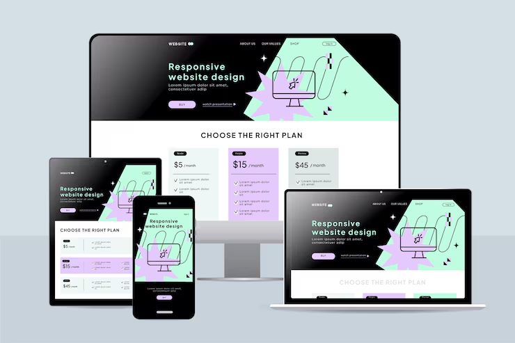
At Website Solution India, we build fully responsive websites that deliver a seamless experience across all devices including desktops, tablets, and smartphones. In today’s mobile-first world, having a responsive website is essential to improve user experience, boost engagement, and maximize conversions.
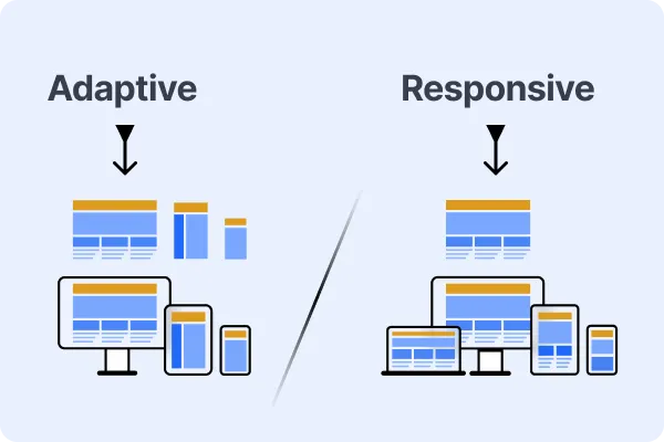
Our responsive web design solutions ensure your website automatically adjusts its layout, images, and content to fit every screen size perfectly. This not only enhances usability but also improves SEO rankings, loading speed, and customer satisfaction.
Why Choose Responsive Web Design?
A responsive website helps your business reach customers everywhere without compromising design or functionality. With increasing mobile traffic, responsive design ensures your visitors enjoy a smooth browsing experience, leading to higher trust and better conversion rates.
A responsive website is no longer optional — it’s the foundation of modern digital success, customer engagement, and search engine visibility.
Seamless multi-device compatibility for desktop, mobile, and tablet users.
Optimized mobile experience with fast loading and user-friendly navigation.
Flexible layouts that automatically adapt to different screen resolutions.
Frequently Asked Question
Here are some common questions clients ask about our responsive web design services.
Why is responsive design important for my website?
Responsive design ensures your website looks and works perfectly on all devices, improving user experience and engagement.
Will responsive design improve my SEO?
Yes, Google prioritizes mobile-friendly websites, which can improve your search rankings and visibility.
Does responsive design affect website speed?
A properly built responsive website is optimized for performance, helping reduce load times across devices.
Can I convert my existing website into a responsive one?
Yes, we can redesign and optimize your current website to make it fully responsive and modern.

